

COMMUNICATION ARTS DESIGN AWARD 2024 | APPLIED ART AWARD 2024 | THE YOUNG ONES 2024 | THE MOTION AWARD 2023 | INTERNATIONAL DESIGN AWARD (IDA) 2023
*Refer to THE PROCESS BOOK for a detailed exploration of the creative process and additional information.
TIMELINE: 5 weeks
ROLE IN THE PROJECT: Solo Project
PROJECT TYPE: Branding
*Branding Package Video
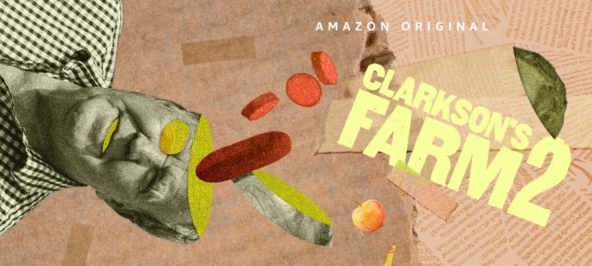
CLARKSON’S FARM 2 TV Show Rebrand
/ABOUT THE SHOW/
"Clarkson's Farm" is a British documentary series on Amazon Prime Video that blends reality TV, documentary storytelling, and comedy. It stars Jeremy Clarkson, formerly of "Top Gear" and "The Grand Tour," as he navigates the challenges of managing a farm despite his lack of experience. The show humorously portrays his attempts at agriculture and livestock management, targeting a mature audience with content that includes cursing, alcohol, smoking, and animal mating scenes. The second season, released in early 2023, follows Clarkson as he expands his farm operations, introducing new animals and a restaurant to boost profitability.
/OBJECTIVE/
The rebranding of "Clarkson's Farm" Season 2 aimed to develop a cohesive and impactful branding package that enhances the show's appeal while introducing new visual elements reflecting its humorous and energetic tone to establish a consistent branding package. The rebrand focuses on five main visual elements: the title sequence, the Ending sequence, the Episode cards, the Lower thrids, and the supers.
1 Research & Strategy
The original branding of "Clarkson's Farm" is relatively understated and straightforward, reflecting the show's authentic and unscripted nature. It features a simple typographic approach that utilizes a modern, handwritten font, conveying a personal and informal tone that matches Jeremy Clarkson's charismatic hosting style.

1. Opening & Ending

The color palette and visual elements are minimalistic.The title is the logo.
It could add more narrative to the opening.
2. Episode Cards


Illustrations are crafted in a playful and somewhat rustic style, resonating with the show's agricultural and rural themes.
It could incorporate more humor into the episode cards beyond just hinting at each episode's content.
3. Lower Thirds


The lower third is very minimal and only functions.
Enhance the lower thirds by incorporating more distinctive characteristics and a broader color palette to better align with the show's thematic elements.
2 Style & Test
For the rebranding of "Clarkson's Farm," I took a different approach from my usual illustrative style. Instead of creating assets from drawings, I planned to develop the design elements directly from photos and video clips of the show. This method will better align with the reality series' authentic and unscripted nature, ensuring the branding resonates with the show's real-life content. This shift challenges me to explore new design techniques and expand my skill set, providing a valuable learning experience.
I started with a keyword list focused on narrative elements and visualized unusual crops due to Jeremy's farm's unpredictability. I experimented with designs by combining random objects. Below are the initial style frames using two collage techniques: COMBINE and SEPARATE.
NO.1 Unprofessional farmer
CHAOTIC
Live Stock
Fun

RAW
Weird
Real

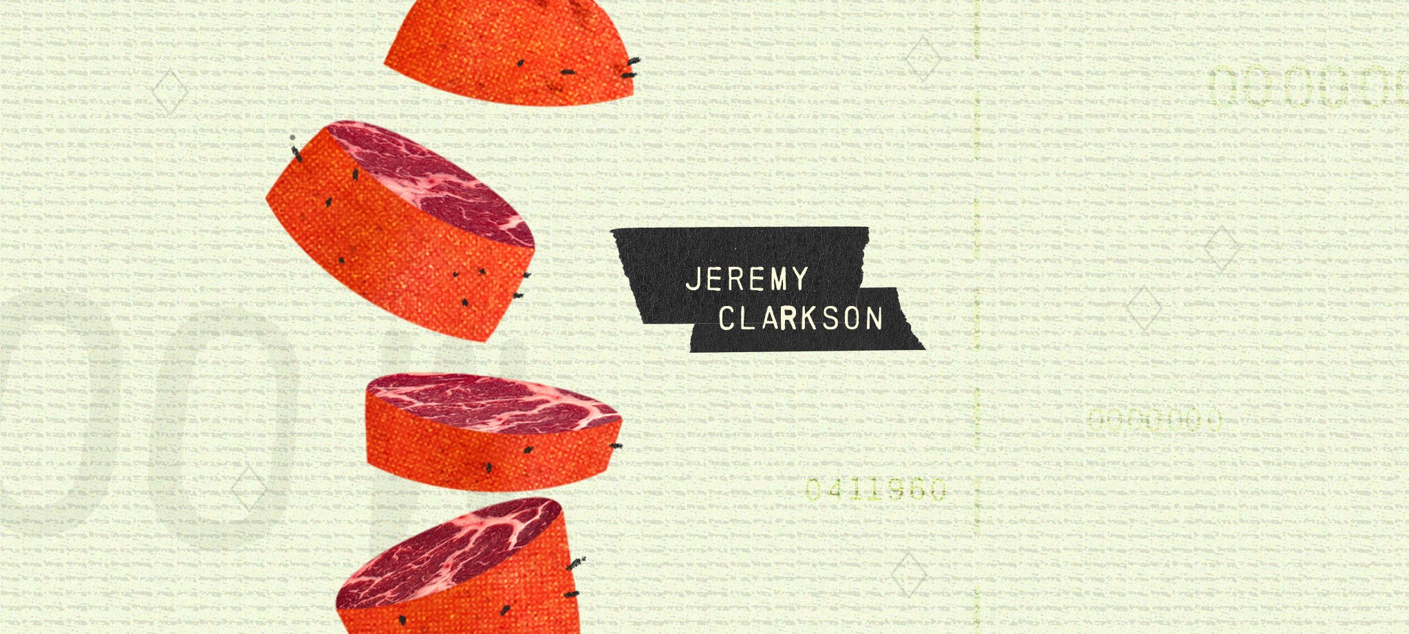
JEREMY CLARKSON
This style emphasizes the chaotic and bizarre aspects of Jeremy's farming journey. By merging Jeremy's image with a pumpkin, I convey his novice status in farming, depicting him humorously as a 'farming infant.' Adding a banana injects a playful, humorous element, resonating with the show's lighthearted tone. The bandaged banana further symbolizes the constant need for repairs and adjustments, a recurring theme as Jeremy navigates the myriad challenges of farm management. This collage creates a vibrant, dynamic representation of the show's spirit.
STYLE 2 - Separate


STYLE 1 - Combine
In this style, I delve into the intriguing question of "What's inside?" By slicing objects open, I aim to reveal the authentic, hidden layers, mirroring the show's genuine and in-depth exploration of farming life. This approach underscores the show's unique and engaging nature. I've incorporated a word-textured background to reflect another significant aspect of the show: Jeremy's time spent in the office strategizing and problem-solving. This design element connects his indoor planning and outdoor farming activities, enhancing the thematic depth of the visual presentation.


3 Style & Test
I further developed Style 2 using the SEPARATE method, enhancing its visual appeal by improving contrast and refining the color palette. This adjustment made each element more distinct, creating a final style that better captures attention and conveys the show's dynamic essence.
VISUAL 1- Title sequence
The title sequence highlights key contributors' credits against a background of shapes and lines with halftone effects, resembling paper money. This design emphasizes farming as both a lifestyle and a business, mirroring the aesthetics of currency to underline the economic challenges of farming, aligning with Jeremy Clarkson's efforts to manage his farm efficiently.

/The Title Sequence Video/


/Style Frames/
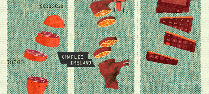
STYLE FRAME 2 - Episode Cards
The original design of the episode cards was already visually appealing. Building on this foundation, I enhanced the visual metaphors within my style and concept to subtly hint at the content of each episode. This approach allows the audience to glean insights into upcoming events humorously and efficiently without disclosing too much information from the show. This method engages viewers and piques their curiosity about the episode's storyline, enhancing the viewing experience.


/The Episode Cards Compilation Video/
/Style Frames/
/The Lower Thirds Compilation Video/
The lower thirds in the show are minimally invasive, typically appearing only to inform the audience of the time of year relevant to the farming activities depicted. Building on the existing visual style of the show, I designed three variations of lower thirds to ensure clarity against any background. These include options optimized for darker and lighter backgrounds and a narrower version to maintain visibility without overcrowding scenes that are already visually rich. This approach integrates the texture and shapes seen in other visual elements of the show, ensuring a cohesive and unobtrusive presentation that complements the overall aesthetic.

STYLE FRAME 3 - Lower thirds


/Style Frames/
4 Conclusion & Reflection
Step Out of Comfort Zone
This project was a valuable opportunity to step outside my usual illustrative style and experiment with using existing assets for design. It challenged me to expand my design skills in new directions. Despite the project's short timeline, the overall outcome was positive, demonstrating the successful adaptation and execution of new design techniques.
Trust the Process
Initially, my designs did not meet my expectations, but I trusted the process and observed noticeable improvements daily. This experience has been incredibly fulfilling, as I have seen substantial personal and professional growth.
Always Learning
During the project, I embraced the challenge of learning new design techniques that significantly broadened my skill set. I gained practical experience designing frames using existing assets, which required a delicate balance of integrating typography with imagery to create cohesive designs. Additionally, I honed my ability to use contrast effectively, enhancing the visual communication of each design element. This exploration into new areas diversified my design approaches and deepened my understanding of visual aesthetics in media.
Areas For Improvement
Typography: Explore further improvements in type choice to enhance visual impact.
Design Options: Create more options for lower thirds and supers to accommodate various situations.
Canvas Size: Increase the canvas size in design files to ensure more precise and detailed visuals in future projects.
