
MOTIMATIC: Design Sprint
TIMELINE: 2 Days | CLIENT: Motimatic | PROJECT TYPE: Motion Design | ROLE IN THE PROJECT: Solo Project
OBJECTIVE
Motimatic is a platform designed to assist students in accessing various university activities and resources. It provides students with information about university opportunities and events, aiding their academic and extracurricular pursuits.
TASKS
Motimatic asked me to create a short video (7-12 seconds) to assess my capabilities as part of a design test. The video targets traditional-aged students who have discontinued their education, informing them of an opportunity to overcome challenges and re-engage with learning.

1 Script & Concept
With a tight deadline and minimal initial information, the project required rapid adaptation and creativity. I began by distilling the essence of the brief into a concise script, capturing the core message that needed to be conveyed. I followed this with quick sketches to lay the foundational visuals. These preliminary sketches are crucial, serving as the stepping stones to the more time-intensive phase of animation.


2 Design & Frames
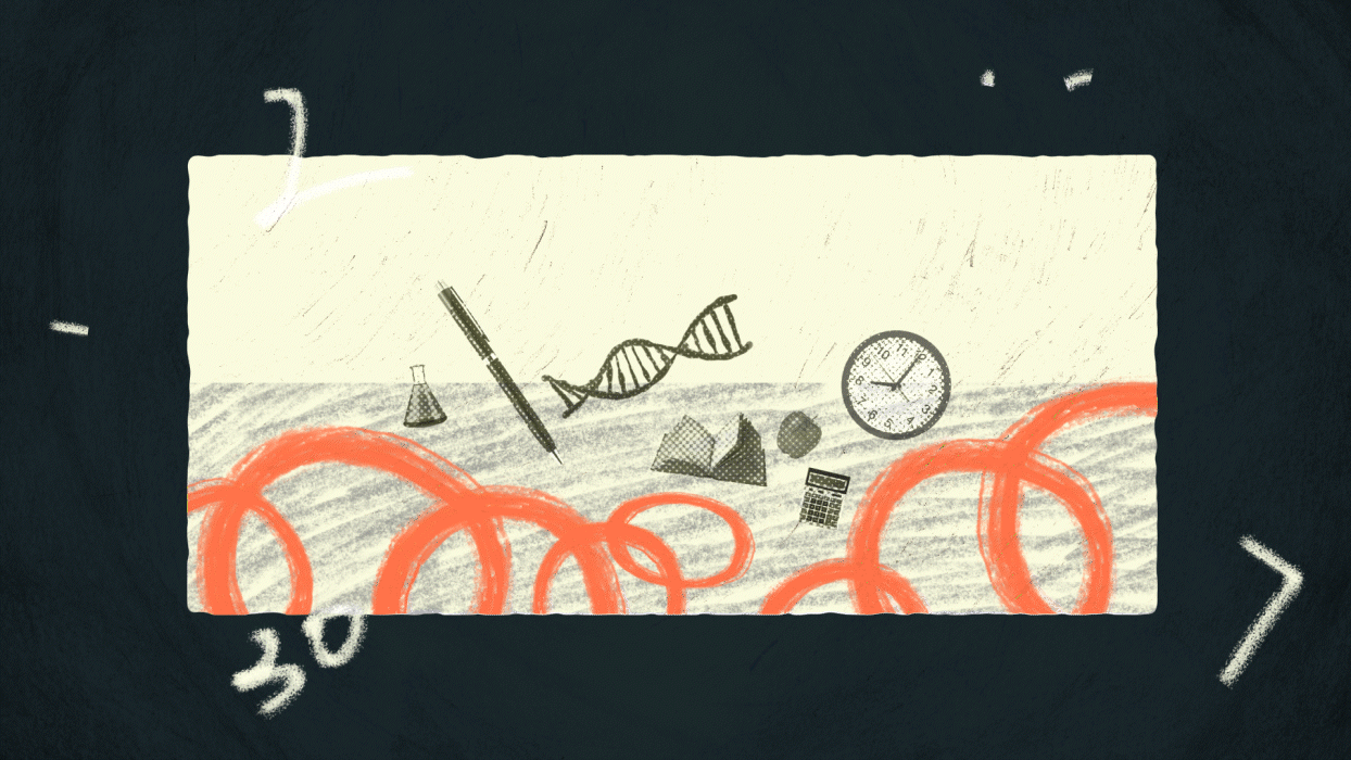
During the initial rough storyboarding, I found that animating all eight frames would exceed the company's 12-second limit. After carefully evaluating and removing several frames, I streamlined the narrative to maintain impact and meet time constraints. This allowed me to finalize the style frames for an engaging and concise video.
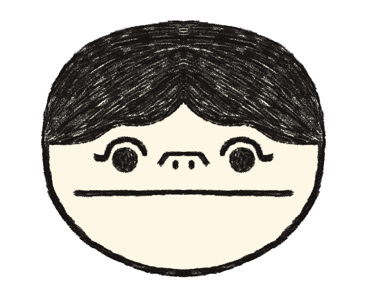
The color palette uses neutral tones for a calm background, with grass green and bright orange highlights to inject vitality and optimism. These vibrant colors create dynamic contrast, emphasizing vital visual elements and conveying energy and hope.
3 Conclusion & Reflection
Positive Takeaways
Despite the challenges, the project reached completion with a compelling visual style and a fully realized narrative. Additionally, the fast-paced nature of this project provided a valuable opportunity to challenge myself and grow in a sprint-style working environment, which was both enjoyable and professionally enriching.
Project Visuals Adjustment
Feedback from friends who reviewed the video highlighted that using dark colors was somewhat excessive, contributing to a dark and stressful atmosphere for viewers. This insight is crucial as it points to the need for better balancing of color tones to suit the intended emotional impact of the video.
Understanding Client Preferences
After receiving feedback from the company, I conducted further research and realized that Motimatic, as a tech company, tends to favor a clean, vector style in its visual presentations. This preference differs from the organic and textured style I used. Moving forward, I recognize the importance of dedicating more time to researching a company's stylistic preferences early in the project cycle.
